UX: Let’s try out flexible bento box grids as recommended by Figma
- 2024.01.21
- Figma
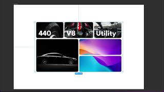
Its cool if used semantically. Here are a few use cases I believe where this kind of UI can be used in your products:
– Key highlights
– Toggle settings
– Visuals/Gallery
– Product display
– combination of above.
Before you ask how to make it in CSS, I’ll give my thoughts that comes into my mind if I were to code it in CSS. I would use nested grid/flex or a combination of both depending upon of the nature of data that has to be placed and squeezed in responsive context.
Thoughts?
-
前の記事

Power Automate Approval Kit – Overview | Part 1 2024.01.21
-
次の記事

power window installation maruti Swift LXI to vdi 2024.01.22